Bisbee, Arizona Brochure

Bisbee needs more visitors from across the country to come to visit.
Deliverable
Print Design & Advertising Campaign
Year
2020
Client
Bisbee, Arizona (Fictional Project)
Design Tools
Indesign & Illustrator
About
For this project, Bisbee, located in Arizona, was looking to bring more guests from across the country to come and visit. They wanted a brand new brochure that would highlight the beautiful colors of the desert and show a little bit about Bisbee and what it has to offer. The client wanted the hashtag bebisbee; secondly, “Come be Bisbee for a while” and “Come be refreshed, be inspired by yourself” needed to be a part of the design.
Bisbee was not getting the same amount of tourists as they usually would get, and in need of a way to bring guests from across the country, they wanted a new brochure. The Brochure needed to feature Annual events, dining, nightlife, Bisbee, and things to do along with a body copy provided from the client that they wanted within the brochure. I took images from their website and highlighted tours and famous sights from Bisbee within the Brochure. This brochure brings a fresh take on what Bisbee offers to guests living in Arizona or throughout the U.S. I took images from their website and highlighted tours and famous sights from Bisbee within the Brochure. This brochure brings a fresh take on what Bisbee offers to guests living in Arizona or throughout the U.S.
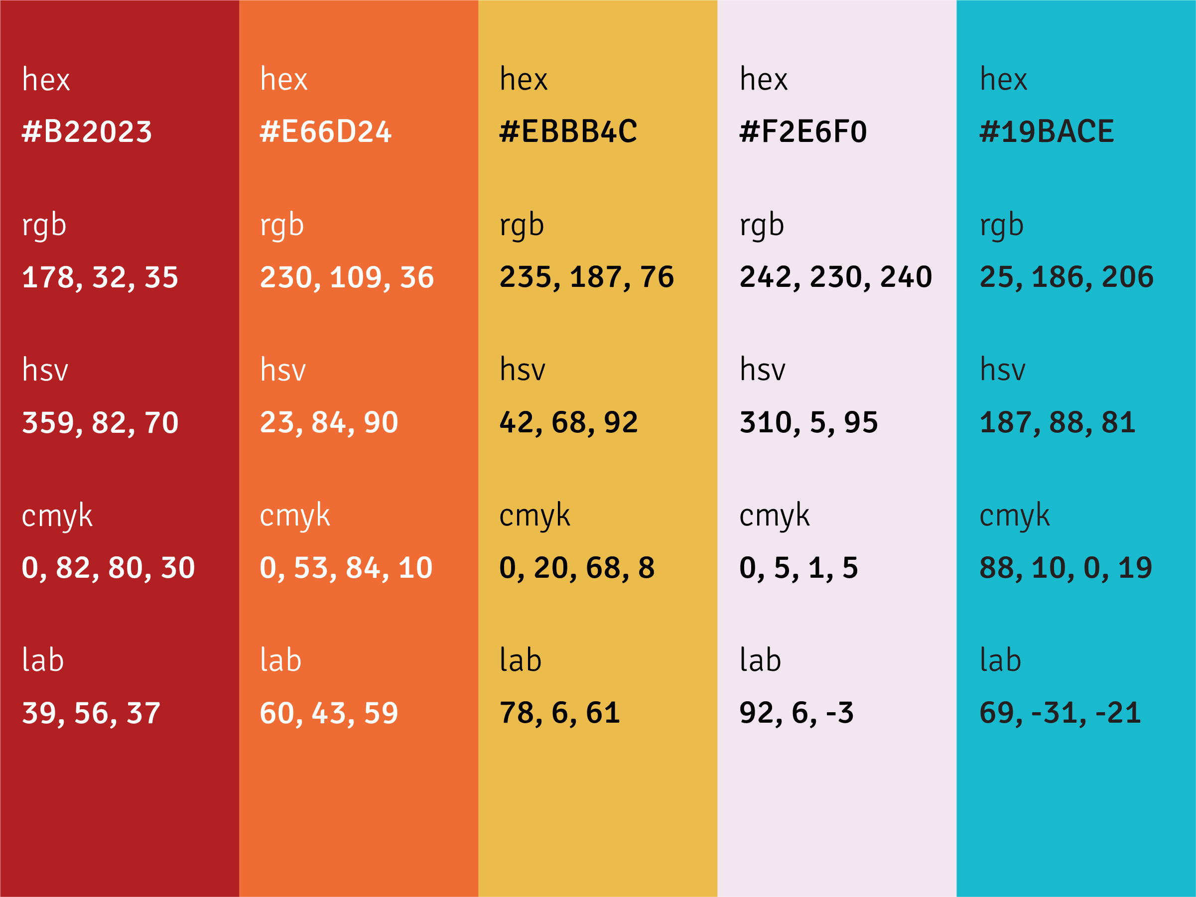
Color Palette
Bisbee is an iconic destination in Arizona, and I took inspiration from a desert image on the back side of the brochure with a cactus. The sky is this beautiful tint of purple used in the color palette, bringing a fresh feel to the brochure. Touches of blue, orange, red, and yellow bring warmth, energy, and friendliness to the brochure as the destination is full of amazing sights, and the weather is excellent all year around.

Typography
HK Grotesk is a san serif typeface inspired by classic grotesques; it has a variety of weights to it and supports a wide range of applications. For this brochure, the semibold and black weights are used. The typeface is chosen not to take away from the nature of the brochure and its aesthetic.

