BURS. New Brand Identity

A construction company in Tucson, AZ, needed a rebrand.
Client
Juan Grijalva (Brand Owner)
Design Tools
Illustrator, XD, Photoshop, Google Slides
Deliverable
Brand & Identity
Year
2022
About
The old brand name, "IRONWOOD," was common and could be found throughout the world wide web. Additionally, other businesses used "IRONWOOD" as their primary name. To stand out, the company needed a name change. That's where "BURS" comes in. An easily recognizable name was a must, and "BURS" was perfect, as it had no presence online as a construction corporation.
Old Logo
The previous logo appeared outdated due to its muted colors and generic typeface. It did not establish a clear visual connection with the rest of the brand's materials.

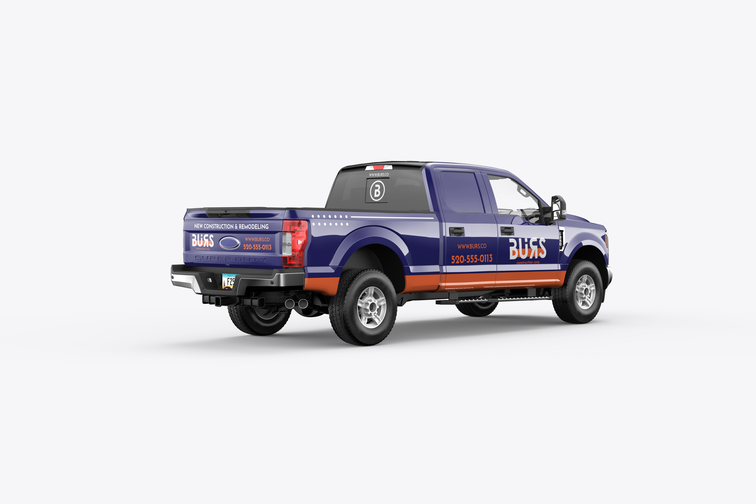
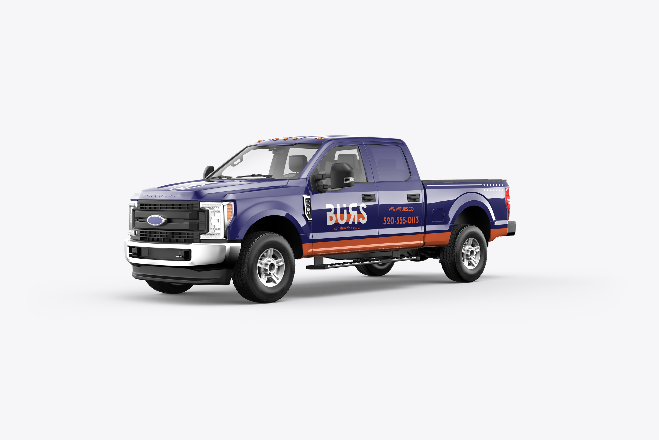
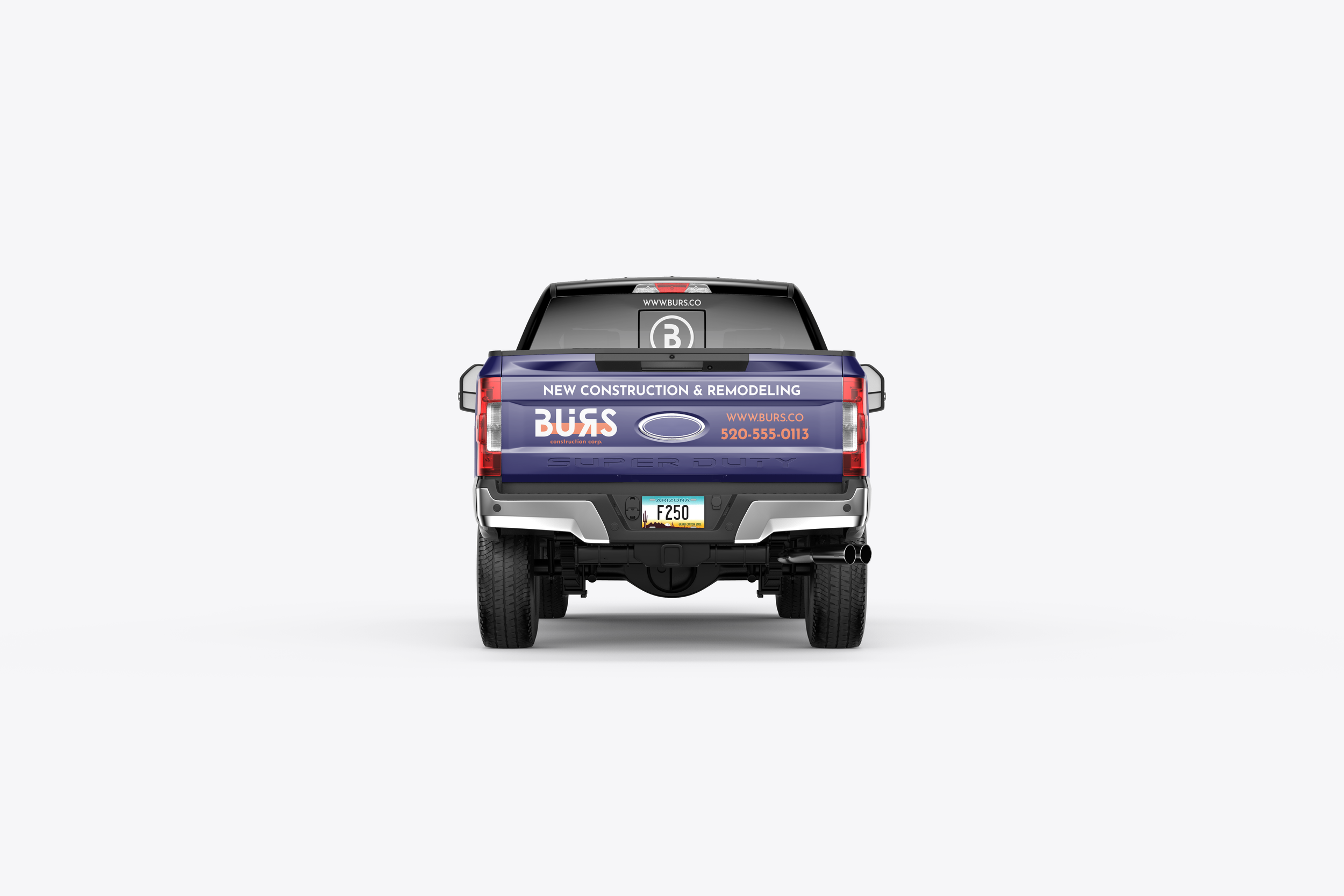
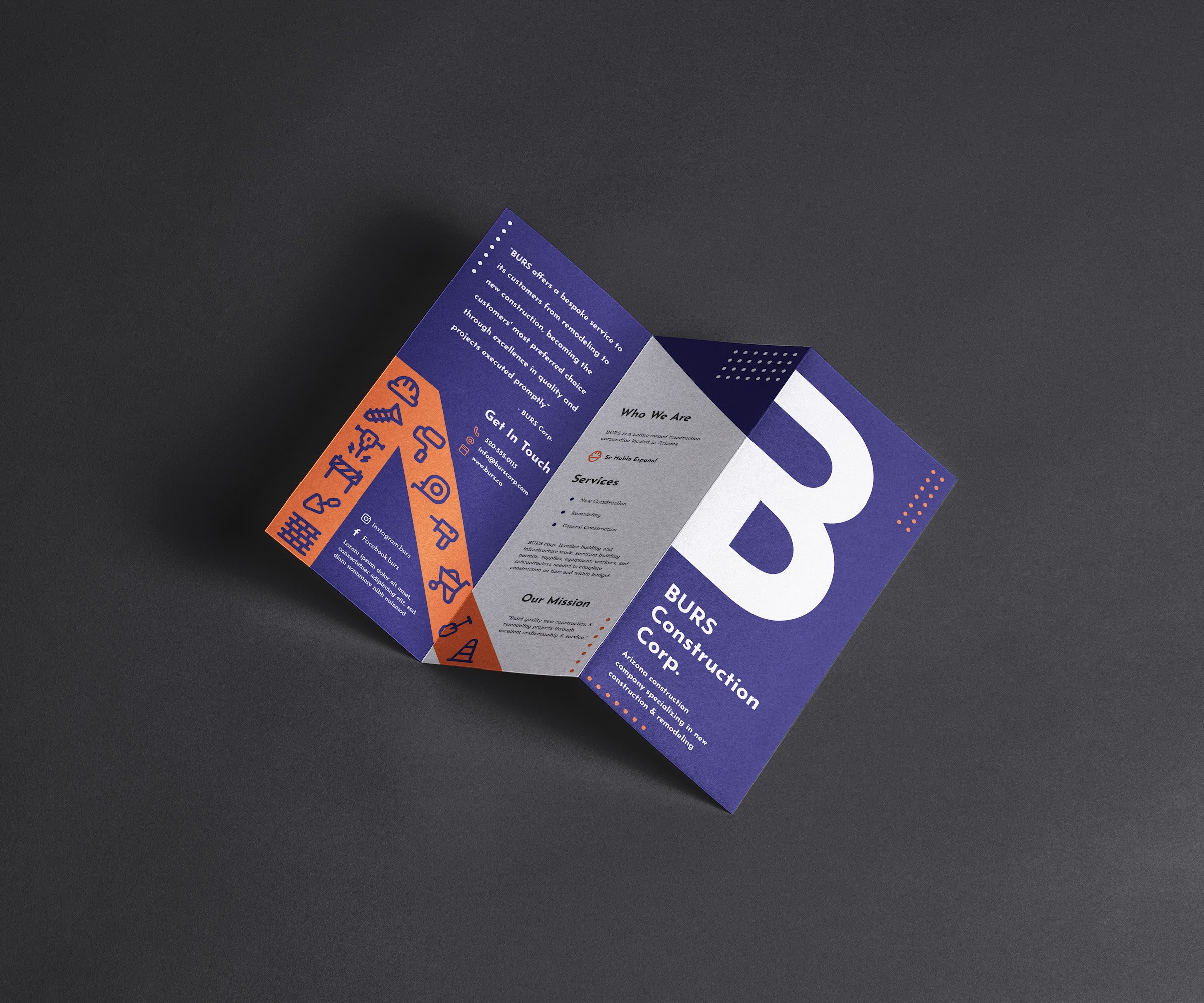
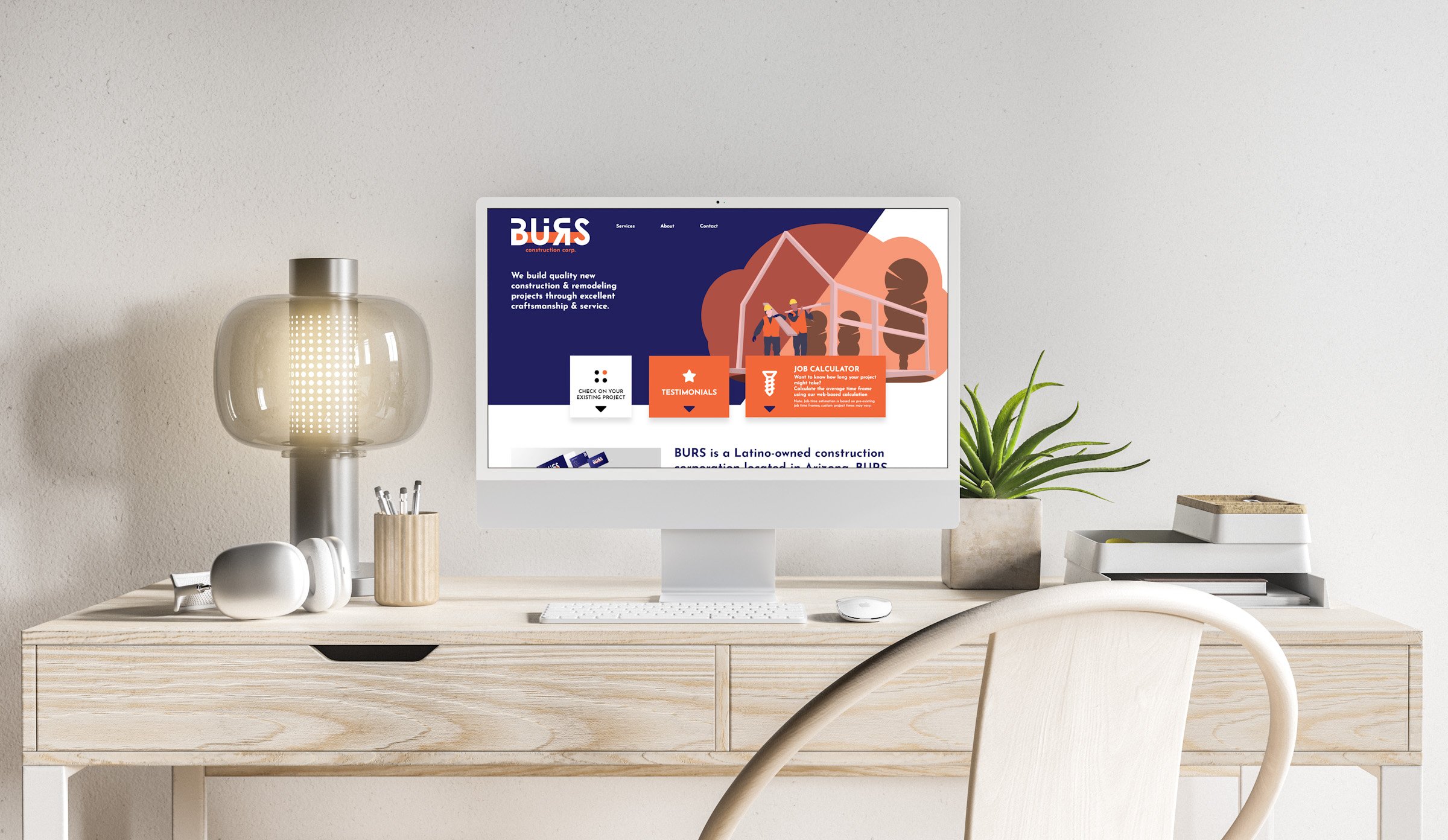
New Logo
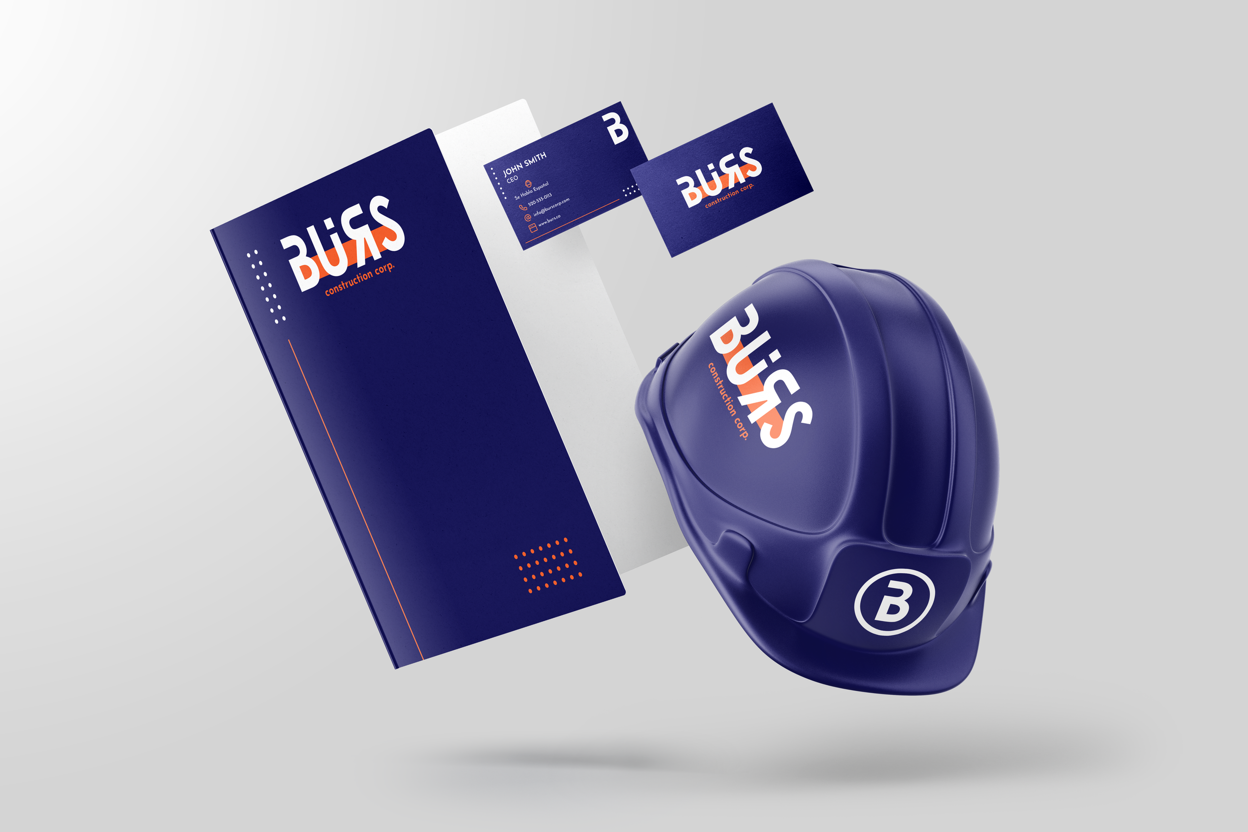
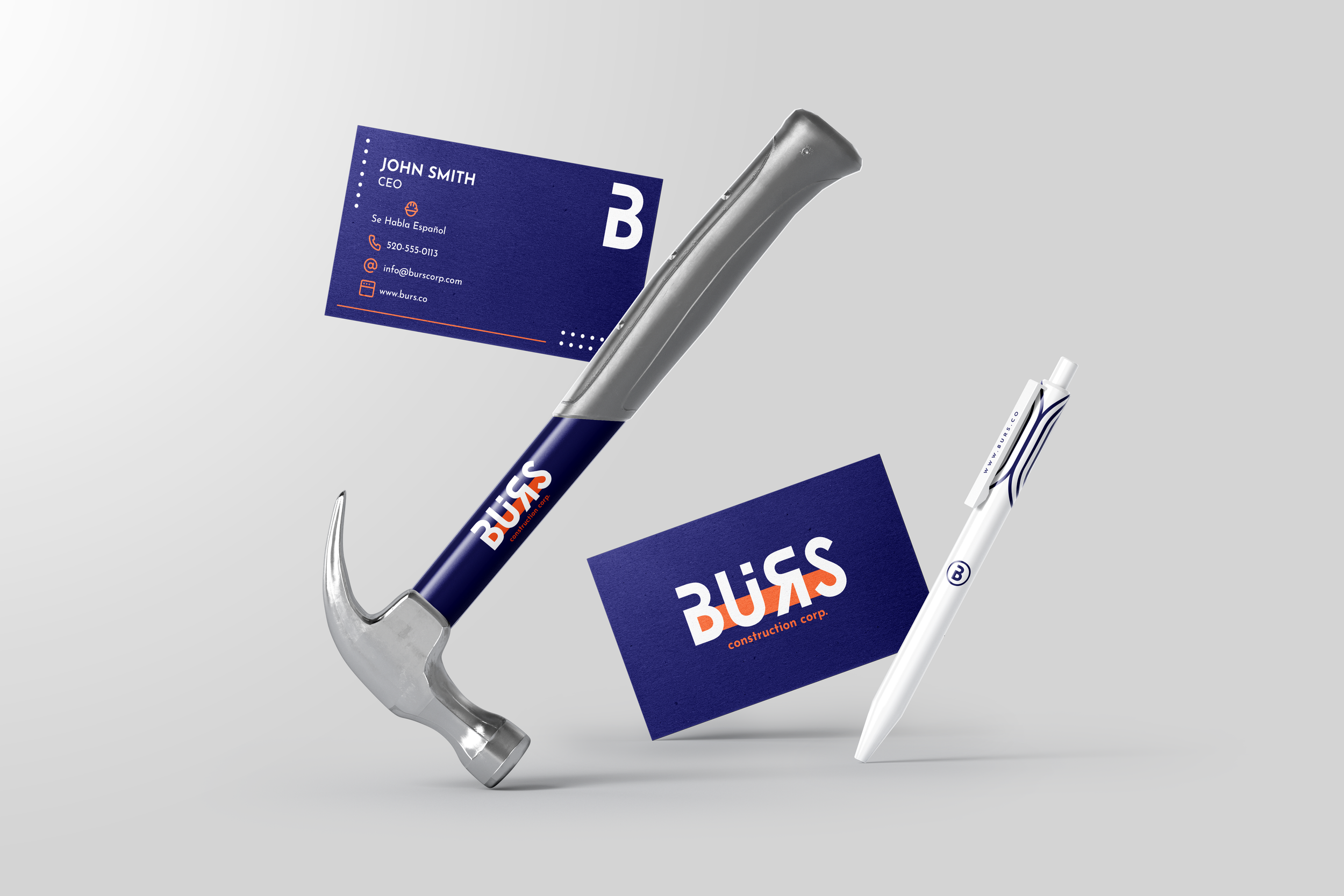
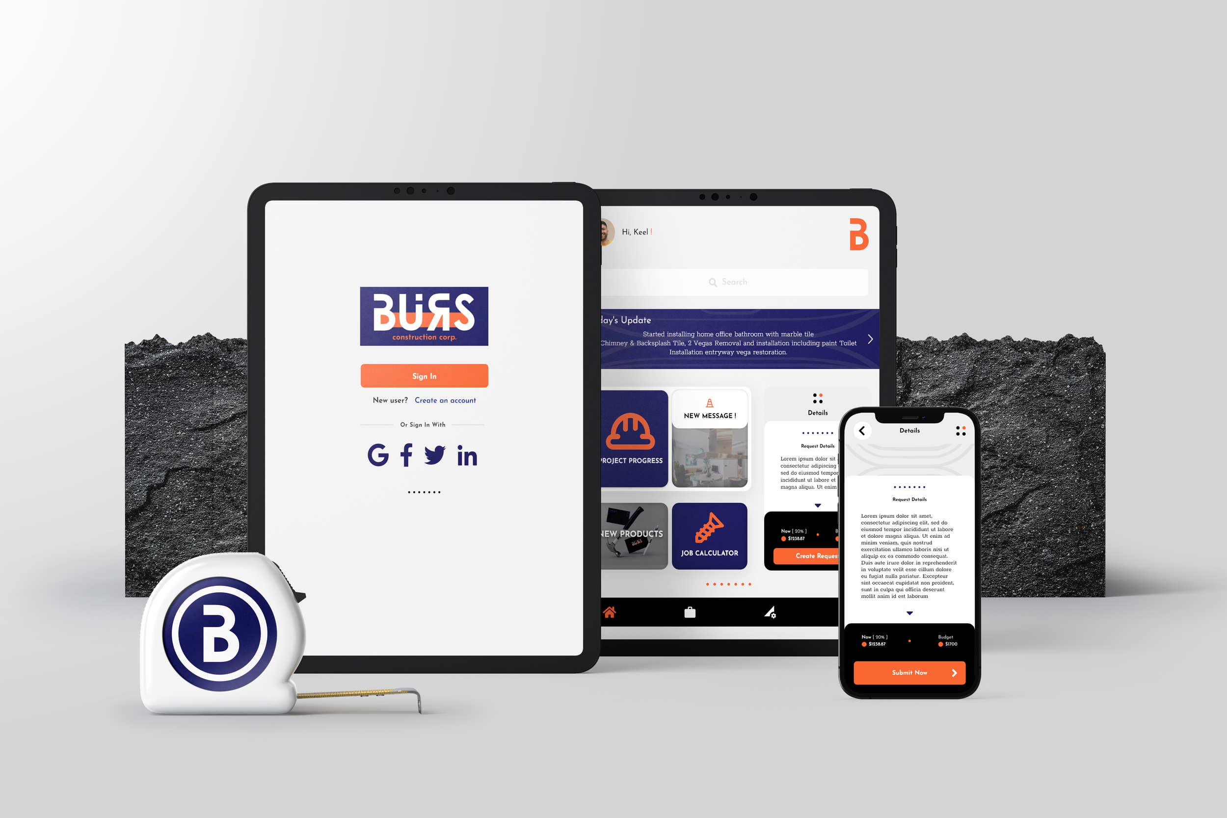
The new logo is bold and precise, defining the brand's true identity with modern qualities. A unifying color palette seemingly connects the brand's material and construction qualities. The logo's primary typographical treatment is bold, with white contrasting against the brand's grounding blue. The orange brings an energetic quality to the brand's elements and logo.

Color Palette
When it comes to the construction market, colors like yellow and orange are frequently used within the industry. I decided to incorporate these colors into the brand's design, since energetic colors like yellow and orange can help construction brands and tools stand out. The client required a sophisticated design that would distinguish the brand from local competitors.
The orange brings an energetic feeling to the brand, while the blue signifies loyalty and security, grounding the brand. The white, gray, and black colors contribute to the overall sophistication of the palette, enhancing clarity within elements and the brand's color scheme.

Typography
Josefin Sans is a geometric sans-serif typeface with an elegant, almost vintage feel. It's perfect for use in headlines, titles, and quotes, particularly when used in larger sizes to bring out the brand's rugged construction roots.
Rokkit is inspired by distinctive slab serif typefaces and contains unique geometric forms. It's excellent for displaying large bodies of text and can also be used in headlines as it reads very well in larger instances.


Brand Elements
I created visual elements to unify all print and digital materials. These elements were inspired by the intricate patterns found in a piece of wood. The previous brand's print materials featured a pattern inspired by the inner parts of a tree trunk. I expanded on this by designing additional line patterns, as seen on the left.